
The X Profile Banner Strategy: What to Put Above Your Tweets

Get the whole profile scored, not just the banner
Banner, bio, avatar and display name read together with your posting habits and timing — out of 100, in plain language — so the redesign fixes what's actually losing you the follow.
Your X banner is the first thing a stranger sees when they land on your profile, and most people leave it blank or fill it with a stock sunset. Treat it like a billboard: pick one of six archetypes (value prop, social proof, lead magnet, credibility, personality, or offer), build it at 1500×500 px with a centered safe zone, and pair it with your bio and pinned post. Done right, it's one of the cheapest ways to learn how to grow on Twitter without posting more.
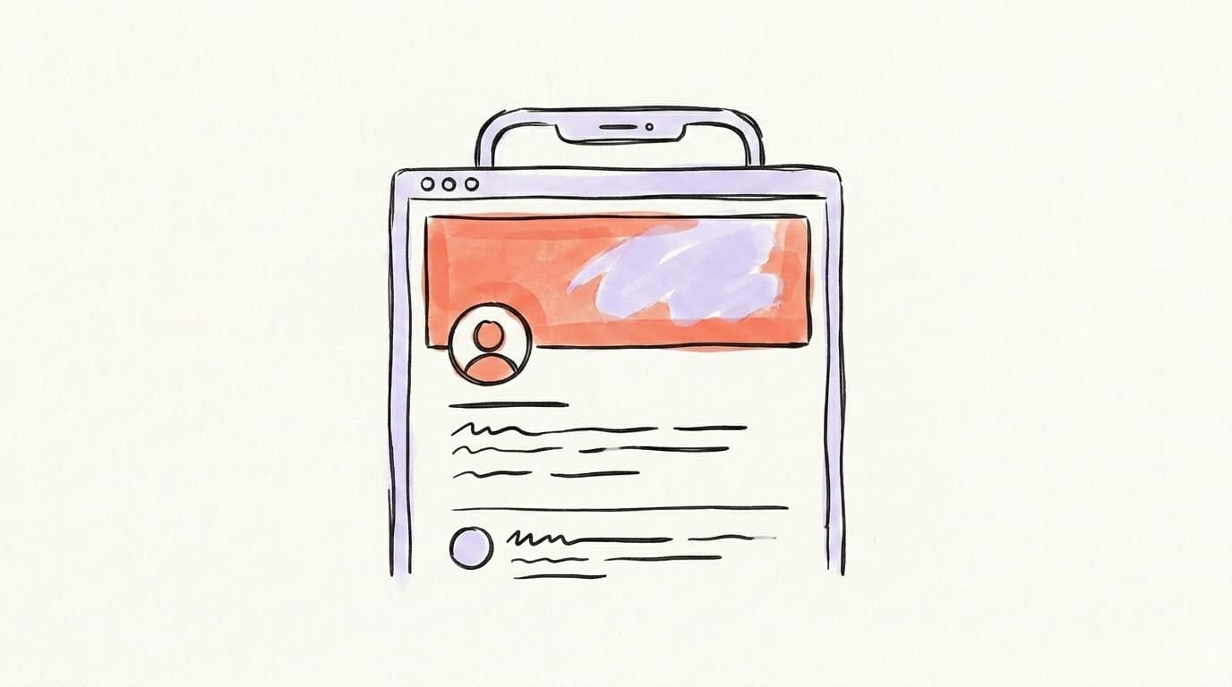
Someone reads your reply, finds it sharp, and taps your name. For the next two or three seconds, your profile decides whether they follow or scroll away. The single biggest visual on that screen is your banner — and on most accounts, it's empty, blurry, or a stock photo of a beach.
This is the most-wasted real estate on the platform, and fixing it is one of the simplest answers to how to grow on Twitter without writing a single extra tweet. This post shows you the six banner archetypes that actually convert visitors into followers, the exact dimensions and safe zones for 2026, and how to design one in ten minutes for free.
Why Is Your X Banner the Most Wasted Real Estate on the Platform?
Your X banner is the most wasted real estate because it's the largest single element on your profile and almost nobody uses it on purpose. When a stranger lands on your page from a reply or a viral post, your banner fills the top of their screen before they read a word of your bio. Growth creator Clifton Sellers calls it "a billboard-like banner that shows your value proposition" — and notes that people "go viral every day on the timeline that miss out on followers because they skip the step." That's the trap: you can earn the click and still lose the follow if the top of your profile says nothing. A good banner does one job — it makes a cold visitor understand who you are and why you're worth following before they have to think about it. Treat it as the headline of a landing page, not decoration.
Here's the mental model that fixes everything: your profile is a landing page, and your banner is above the fold. A visitor "above the fold" hasn't scrolled yet. They've seen your banner, your avatar, your name, and the first line of your bio — nothing more. Every one of those elements has to pull weight, but the banner is the biggest and the one people ignore most.
This is also why the banner is a one-time lever you pull once. You write it once and it works on every single visitor for months, while your tweets each have to earn attention from scratch. If you're serious about how to grow on Twitter, fixing the banner is a one-time job with a compounding payoff.
Here's a full walkthrough of setting up a profile that converts, from a creator who says he grew his X following past 300K:
Content calendar
Plan a month of content in an afternoon
Map out your posts on a visual calendar, batch your ideas, and never stare at a blank page again.
What Are the Correct X Banner Dimensions and Safe Zones in 2026?
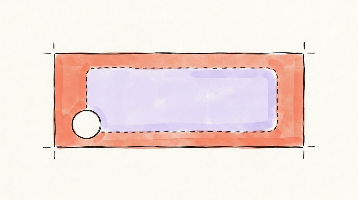
The correct X banner size in 2026 is 1500 × 500 pixels, a 3:1 aspect ratio, saved as JPG or PNG and kept under X's recommended 2 MB file size (Snappa, 2026). That's the canvas X gives you, but it's not the area people actually see. The platform crops the sides on narrow screens and your circular profile photo (roughly 400 × 400 px) overlaps the lower-left corner. The fix is a center safe zone: keep every important word, logo, or face in the middle band of the image — a common rule of thumb is a center box around 1200 × 400 px. Leave the bottom-left corner empty for your avatar, and keep the top and bottom edges clear since mobile shows less height than desktop. Design once at full size, preview on your phone, and adjust.
A few practical rules that save you a re-upload:
- Anchor the message in the center. Anything you put in the outer thirds may get cropped on a phone. Logos, taglines, and faces belong in the middle.
- Keep the bottom-left clear. Your avatar lands there on every device. Don't put a face or word where the profile photo will cover it.
- Avoid the top and bottom edges. A safe margin at the top and bottom keeps text from getting clipped when the height compresses on mobile.
- Use PNG for text, JPG for photos. PNG keeps a logo or tagline crisp; JPG keeps a photo-heavy banner small.
If you want the full set of numbers across every platform — character counts, image counts, and banner sizes side by side — we keep them current in our guide to social media character & image limits in 2026. Bookmark it so you're not re-googling dimensions every time you redesign a profile.
Which Banner Archetype Should You Use?
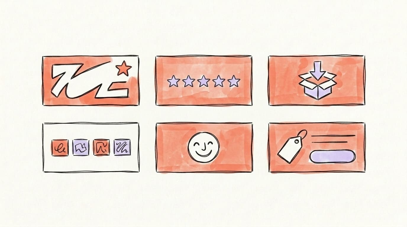
The right archetype depends on what you most need a cold visitor to believe. There's no single "best" banner — there are six that work, each solving a different objection. Value prop answers "what do I get?" Social proof answers "should I trust you?" Lead magnet answers "what's the next step?" Credibility borrows authority from logos and names. Personality makes you memorable and human. Offer points straight at what you sell. Pick the one that matches your goal right now: a new account building trust leans on value prop or personality, while an established creator with a product leans on social proof or offer. A coach with no audience yet shouldn't run a social-proof banner — they have no proof to show — and a creator with 50,000 followers is wasting the space on a generic "I post about marketing" line. You can rotate them as your account matures, because the banner is the easiest thing on your profile to swap.
The "Value Prop" Banner
The value-prop banner states, in plain words, who you help and what they get. It's the safest default for almost any account because it answers the visitor's first question — "what's in it for me?" — before they read your bio. The formula is simple: [outcome] for [audience]. Think "Helping bootstrapped founders hit their first $10K month" or "Plain-English breakdowns of the X algorithm." Keep it to one short line, set in large type, centered in the safe zone. If a stranger can read your banner and your bio together and explain what you do in one sentence, it's working. This pairs naturally with a bio built on the same promise — see our X/Twitter bio ideas for the matching formula.
The "Social Proof" Banner
The social-proof banner shows that other people already trust you, which shortcuts the "is this person legit?" question. Use it once you have proof worth showing: a follower milestone, a notable result, press mentions, or a wall of recognizable client logos. A line like "Read by 40,000 founders" or "As featured in [publication]" does more for a cold visitor than any adjective you could write about yourself. The key is specificity — real numbers and real names beat vague claims. Social proof is most powerful for accounts that sell something or build authority, because it transfers credibility you've already earned into the two-second window where the follow decision happens.
The "Lead Magnet" Banner
The lead-magnet banner advertises a free resource — a guide, template, checklist, or newsletter — that gives visitors a reason to take the next step beyond following. It turns your profile from a personality page into a funnel. The banner names the freebie ("Free: the 12-tweet hook bank") and your bio link or pinned post delivers it. This archetype works best when you have something genuinely useful to give away, because the offer has to be worth the click. It's also the archetype most likely to convert a follow into an email subscriber, which matters if you're building an audience you actually own rather than renting from the algorithm.
The "Credibility," "Personality," and "Offer" Banners
The last three archetypes cover the situations the first three miss. The credibility banner borrows authority — a row of company logos you've worked with, a credential, or a "building [recognizable thing]" line — and suits experts and operators whose résumé does the convincing. The personality banner leans into a face, a hobby, or an inside joke; it's the right call for creators whose draw is them, not a service, and it's the most human and memorable of the six. The offer banner points straight at what you sell — a product shot, a "Book a call" prompt, or a price — and works for accounts already in selling mode with traffic to convert.
How Do You Design an X Banner in 10 Minutes for Free?
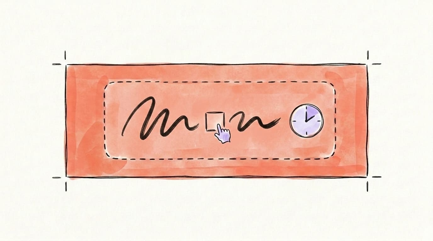
You can design a converting X banner in about ten minutes using a free tool and a blank 1500 × 500 px canvas. The fastest path is Canva: open it, search "Twitter header" or "X header" to load a correctly sized template, and you're already at 3:1. Pick a clean layout, drop in your one-line value prop, and pull every element into the center safe zone so nothing important sits where the avatar or mobile crop will eat it. Use two colors max and one bold font — banners fail from clutter, not from being too plain. Export as PNG if it has text, JPG if it's mostly photo, then preview on your phone before you commit. You don't need a designer or a paid plan for any of this; the free tier of Canva covers the whole job, and a plain banner with one sharp line beats a busy one every time. The whole thing is a one-time setup that keeps working on every visitor afterward.
Here's the ten-minute checklist:
- Start from a template. Canva, Figma, or Pixlr all have free X/Twitter header presets sized to 1500 × 500. Don't build from scratch.
- Write the line first. Decide your archetype and your one sentence before you touch design. The words matter more than the graphics.
- Center everything. Drag your text and logo into the middle band. Leave the bottom-left clear for your avatar.
- Cut the clutter. Two colors, one font, lots of empty space. A clean banner reads in the half-second you actually get.
- Preview on mobile. Upload it, open your profile on your phone, and check that nothing important is cropped or hidden behind the avatar.
Then keep it consistent with the rest of your profile. Your banner, bio, and pinned post should tell one coherent story — the banner makes the promise, the bio explains it, and the pinned post proves it.
Start Growing on X with Postory
A great banner only matters if the rest of your profile and your posting back it up. The banner makes the promise; your pinned post and your steady stream of content have to keep it. Keeping your content organized in one place makes that easier — the post you pin and the threads you publish stay aligned with the value prop your banner advertises.
Postory's post management board keeps your drafts, ready-to-go posts, and pinned-post candidates organized across X, Threads, and Bluesky, so the story your profile tells stays consistent as you grow. Pair a sharp banner with a planned content pipeline and you stop leaking followers from the same traffic.
Try Postory free — organize your X content and keep your profile and posts telling one story.
FAQ
Q: What is the correct X (Twitter) banner size in 2026?
The recommended X banner size is 1500 × 500 pixels at a 3:1 aspect ratio, saved as JPG or PNG under 2 MB (Snappa). Keep important elements in the center safe zone so they survive mobile cropping and the profile-photo overlap in the lower-left corner.
Q: Does a banner actually help you get more followers on Twitter?
A banner doesn't get you followers on its own, but it raises the percentage of visitors who follow after they find your posts. When someone discovers your reply and taps your profile, the banner is the biggest thing they see — a clear one explains who you are in seconds, while a blank or random one wastes the visit. It's a one-time fix that improves every future visit.
Q: What should I put on my X banner?
Put one clear message that matches your goal: a value proposition (who you help and how), social proof (followers, results, or logos), a free lead magnet, a credential, a personality element, or a direct offer. Pick one archetype rather than cramming several in. The banner should pair with your bio and pinned post to tell a single, coherent story.
Q: Where does the profile picture overlap the banner?
Your circular profile photo sits over the lower-left area of the banner on every device. Leave that corner empty — don't place text, a logo, or a face where the avatar will cover it. Keeping the bottom-left clear is one of the most common banner fixes.
Q: How do I make sure my banner looks right on mobile?
Design at the full 1500 × 500 size but keep all important content in the center safe zone, because X crops the sides and compresses the height on phones. After uploading, open your own profile on your phone and confirm nothing critical is clipped at the edges or hidden behind your avatar. Always preview before you call it done.
Q: Can I use a photo as my X banner?
Yes — a photo works well for personal-brand and personality banners, especially a clean shot of your face or workspace. Save photo-heavy banners as JPG to keep the file small, and if you add any text on top, make sure it stays legible against the image and sits in the center safe zone. Avoid busy photos that fight with your avatar and name.
Q: How often should I update my X banner?
Update it whenever your positioning, offer, or biggest proof point changes — there's no fixed schedule. Many creators swap banners as they hit new milestones (a follower count, a launch, a new lead magnet) since the banner is the easiest profile element to change. If your banner still matches what you do today, leave it alone.
Related articles
How I Got My First 100 Followers on X (From a Dead Account)
I started a brand new X account with zero followers and had my first 100 real followers a few days later. Here's the exact playbook.
Jul 19, 2026
How to Quote Tweet on X: 5 Formats That Grow Your Account
How to quote tweet on X, plus the 5-format playbook that turns bigger accounts' reach into your own followers in 2026.
May 29, 2026
X/Twitter for SaaS Founders: The Distribution Playbook
A distribution playbook for SaaS founders on X: positioning, content pillars, and the founder-to-product funnel that turns followers into paid users.
May 26, 2026