How to Format LinkedIn Posts That Actually Get Read in 2026
LinkedIn posts are skimmed, not read. To get engagement, design for the mobile "see more" cutoff at ~140 characters, use generous line breaks, keep paragraphs to 1–3 sentences, add bullet points for lists, and use Unicode bold sparingly — never on keywords you want searchable.
You can write the sharpest insight on LinkedIn and still get 42 views. Not because the idea is weak — because the post looks like a paragraph from a Terms of Service page.
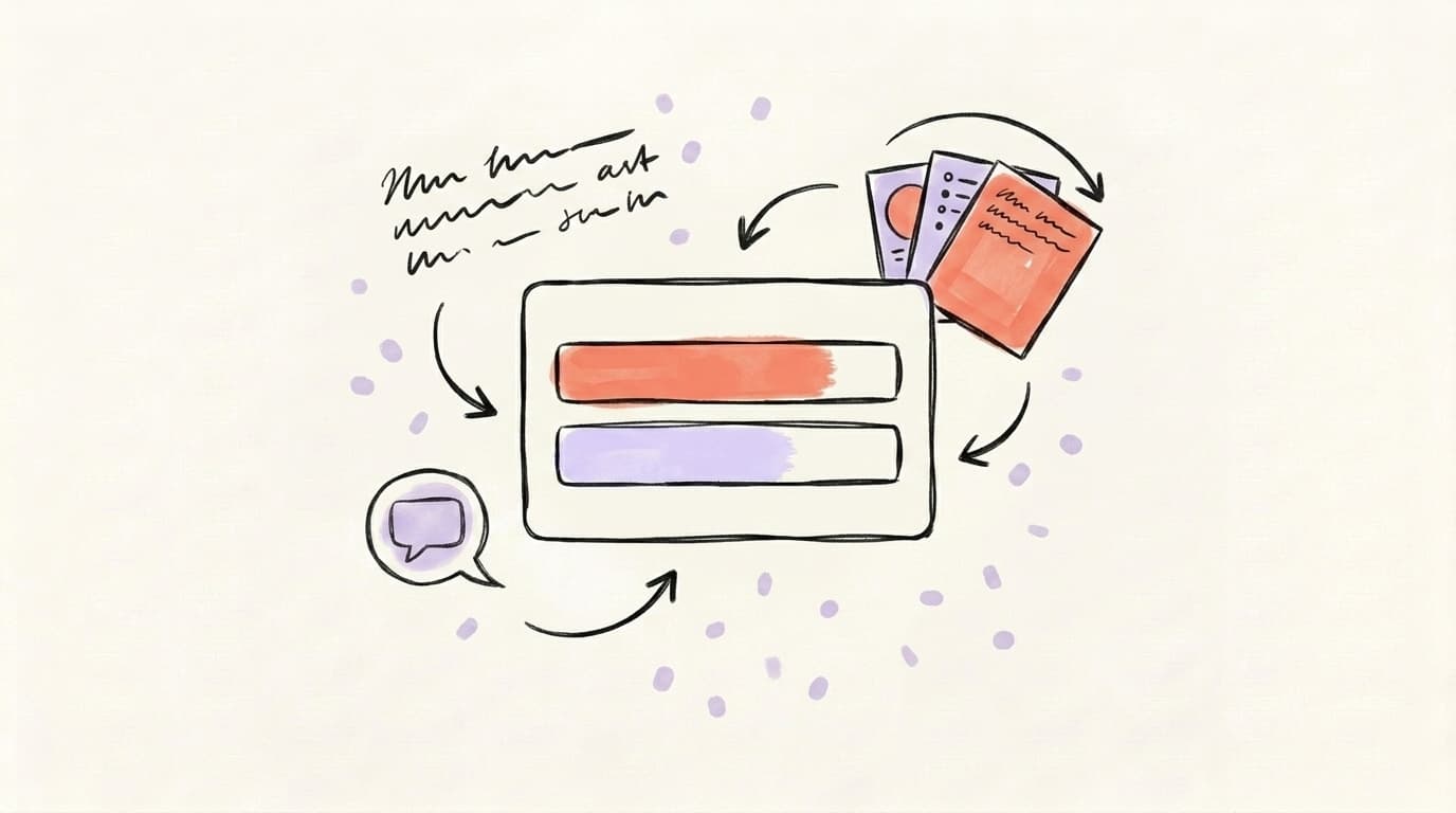
LinkedIn is a skim-first feed. Readers decide in under two seconds whether to tap "see more." Formatting is the thing that buys you those two seconds. This post walks through how to format LinkedIn posts the way high-performing creators actually do it in 2026 — hooks, line breaks, bullet points, bold text, emoji use, and what to avoid.
Why Does LinkedIn Post Formatting Matter So Much?
LinkedIn post formatting matters because the feed is a skim environment, not a reading environment. Readers decide whether to stop on your post in about two seconds, and that decision is driven almost entirely by visual shape — not content quality. A dense block of text reads as effort before anyone has read a word of it, so most people scroll past regardless of how good the insight is. Proper formatting — short paragraphs, line breaks, bullets, and a hook designed for the mobile "see more" cutoff — increases the chance a reader tolerates the first two seconds, taps "see more," and finishes the post. That extra dwell time feeds directly back into the LinkedIn algorithm: longer read-throughs and higher comment rates push the post to more feeds. Formatting isn't cosmetic polish. It's the difference between a post that gets 80 impressions and a post that gets 80,000.
Pierre Herubel, who has racked up more than 20 million LinkedIn views since 2023, says it plainly: people don't read LinkedIn posts — they scan them. They look at the overall shape, the first line, the bullet points, and then decide whether to invest. You can see him break the process down here:
If the structure is hard to read, people bounce before they ever engage with your idea.
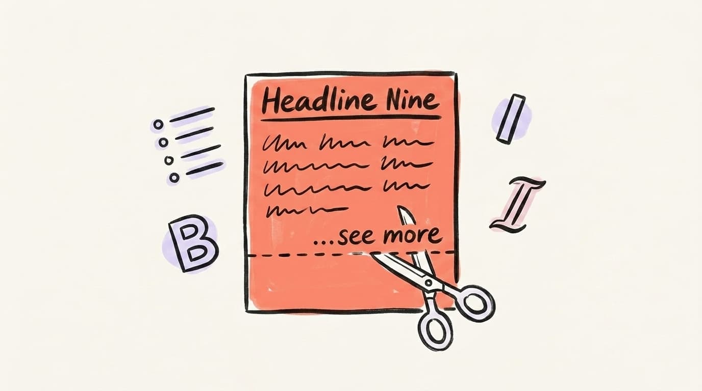
What's the "See More" Cutoff and Why Does It Own Your Hook?
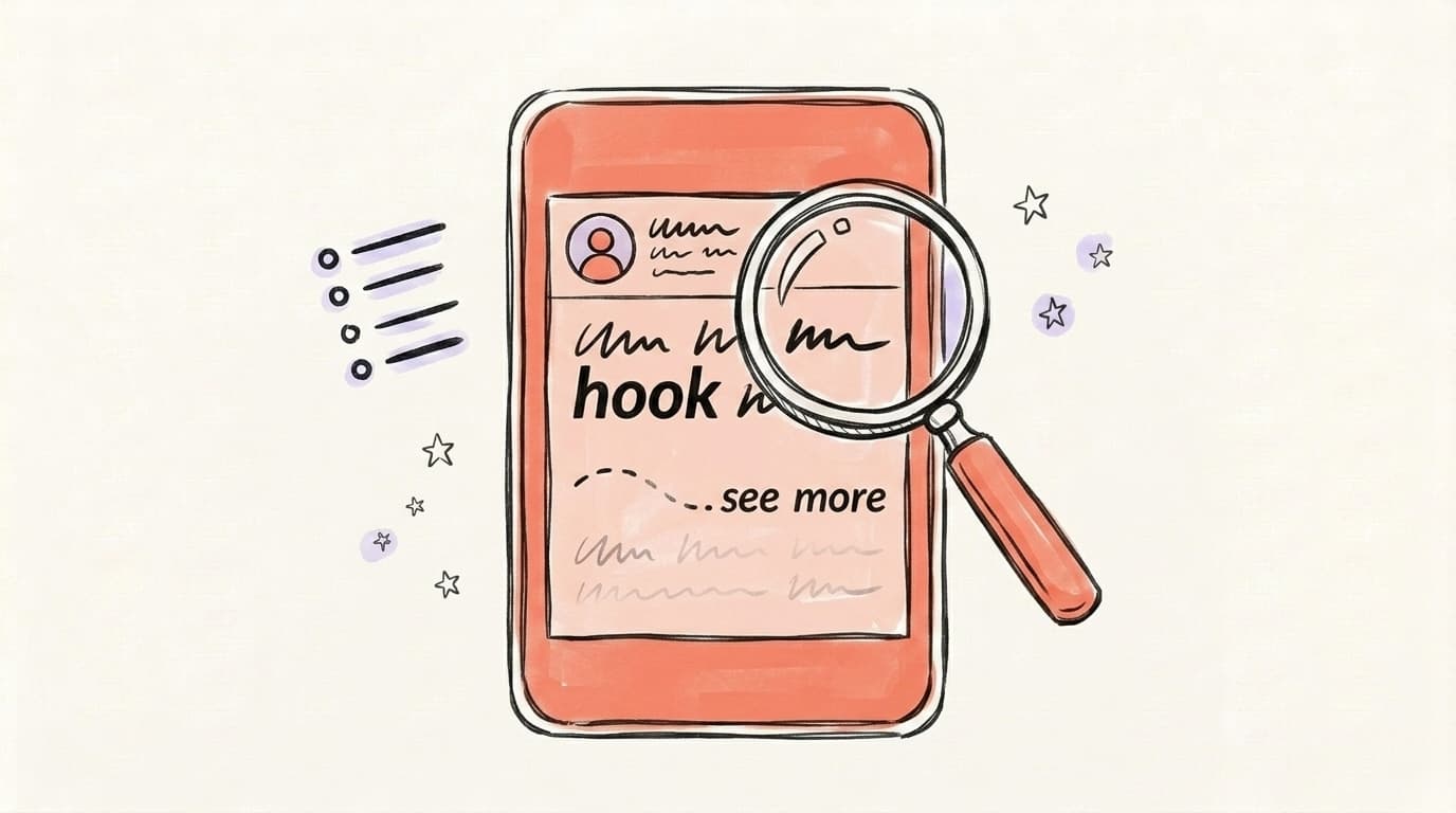
The "see more" cutoff is the point at which LinkedIn truncates your post in the feed and hides the rest behind a tap. On mobile, that cutoff sits at roughly 140 characters; on desktop, around 210. Everything before the cutoff is the entire advertisement for the rest of your post. If those two or three lines don't earn a tap, the rest of your writing doesn't exist — the algorithm sees a scroll-past, and your reach collapses. That means the first line isn't the "intro" to your post; it's the post's billboard. It needs to spike curiosity, promise a payoff, or make a claim worth hearing more about, all within 140 characters. Most creators who write for max reach design their hook first, then write the post around it. They assume anything past line three will be read by a smaller, already-committed audience — and they format accordingly.
AI that learns your voice
Posts that actually sound like you
Postory's AI writes drafts in your voice — not generic AI mush — so you publish faster and still sound human.
Practical rules for the hook:
- Keep it under 140 characters so mobile readers see the full hook before "see more."
- Break the first idea across two short lines — two punchy lines beat one long one.
- Leave a blank line after the hook. It creates breathing room and signals "the rest is easy to read."
- Don't waste the hook on "I'm excited to share…" — nobody taps for that.
A good opening looks like this:
I lost 40,000 LinkedIn followers in a week.

Here's the one mistake that caused it — and the fix.
Two short lines. Curiosity. Specific numbers. Easy to read on a phone.
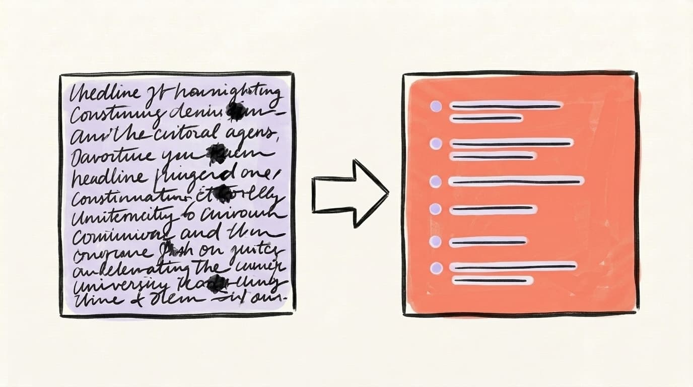
How Do Line Breaks and White Space Change Readability?
Line breaks and white space are the single biggest lever for LinkedIn post readability. A post with generous spacing looks like a list of short, digestible ideas; the same post without breaks looks like a paragraph no one asked for. The fix is mechanical: aim for a visual rhythm where every 1–2 sentences gets its own line, and every new idea gets a blank line of separation. On LinkedIn's composer, one Enter moves to a new line with no gap (useful for bullet items), and two Enters create a visible paragraph break (useful between ideas). Mobile is the design constraint here, not desktop — a post that looks airy on a laptop can still feel dense on a phone because phone screens are narrower. When in doubt, add another line break. The cost of looking "too spaced out" is roughly zero. The cost of looking like a wall is most of your reach. (Reply.io's formatting guide walks through the exact rhythm patterns top creators use.)
Rules of thumb:
- 1–3 sentences per paragraph. Never more.
- One idea per paragraph. If it needs two sentences to explain, that's fine. If it needs five, split them.
- Don't stack three blank lines. Too much space fragments the post and kills rhythm.
- Write, then break. Draft normally, then go back and add line breaks everywhere a natural pause lives.
Should You Use Bullet Points, Numbered Lists, or Plain Paragraphs?
Use the format that matches the content, not the format that looks busiest. Bullet points work when you have 3–6 parallel items that share a structure — tips, steps, reasons, mistakes. Numbered lists work when order or sequence matters — a process, a ranking, a step-by-step. Plain paragraphs work when you're telling a story, making one continuous argument, or building emotion. The mistake most people make is bulletizing everything into a "LinkedIn salad" — every post is a list of 5 tips with a rocket emoji — which actually reduces engagement because every post looks identical in the feed. Vary your structure. A post that opens with a short story and lands on three crisp bullets outperforms a generic listicle. For bullet characters, LinkedIn doesn't support native markdown, so you'll type them manually using "•", "→", "—", or "✓" — just pick one and be consistent within a single post. Don't mix five different bullet styles; it looks like you forgot what you were doing halfway through.
Quick format-to-content map:
- Tips / frameworks / reasons → bullets with
•or→ - Steps / rankings → numbered list (
1.2.3.) - Story / hot take / personal reflection → short paragraphs, no bullets
- Mini case study → 2–3 paragraphs then 3 takeaways as bullets
Can You Actually Use Bold and Italic on LinkedIn?
Technically, yes — but not through a formatting button. LinkedIn doesn't have a native rich-text editor for feed posts, so "bold" and "italic" on LinkedIn are faked using Unicode characters that visually resemble bold or italic letters. Tools like YayText, LinkedIn Makeover's formatter, or Taplio's formatter convert your text into these Unicode variants, and you paste the result into LinkedIn. It works — the visual impact is real and the eye does snap to bold phrases. But there are three real costs. First, Unicode-formatted text isn't searchable by LinkedIn's index, so any keyword you "bold" becomes invisible to search. Second, screen readers read each character individually ("mathematical-bold-H, mathematical-bold-E…"), which is genuinely hostile to accessibility. Third, Unicode doesn't render consistently across every device. Use bold for emphasis on one or two phrases per post — never on hashtags, job titles, company names, or keywords you want found in search.
Practical bold rules:
- Bold 1–2 phrases per post, max. More than that reads as shouting.
- Never bold hashtags or keywords. You lose searchability for zero gain.
- Never bold your entire hook. The hook already has position as its emphasis.
- Test on mobile. Some Unicode fonts render as empty boxes on older Android browsers.
If you care about accessibility — and you should — consider skipping Unicode formatting entirely and leaning harder on line breaks and punctuation instead. White space is the more universal emphasis tool.
How Many Emojis and Hashtags Should a LinkedIn Post Use?
The honest answer is: fewer than you think. Emojis work as visual anchors — they break up text and draw the eye to a list item — but they stop working when every bullet has one. A post with one or two well-placed emojis (a ✅ before a tip, a → as a bullet character) reads clean; a post with twelve reads like spam. The same is true for hashtags. Guidance from top LinkedIn creators has steadily moved toward "fewer is better" — 3–5 relevant hashtags is the current creator consensus, not the 15–20 from 2019. Hashtags belong at the end of the post, not sprinkled mid-sentence, and they should describe the topic cleanly (#B2BMarketing, #ProductLed) rather than stuff niche terms (#B2BSaaSFounderContent). Overuse of either signals "this post is optimized for reach" — which the algorithm may not actually penalize, but which real readers absolutely notice and disengage from. Format for humans first; the algorithm rewards posts that humans actually finish reading.
Quick rules:
- Emojis: 0–3 per post. Use them as bullet anchors, not decoration.
- Hashtags: 3–5, at the bottom, on their own line.
- Never use emojis in your hook. They look fine but hurt click-through because they're visual noise before the reader has committed.
What's the Ideal LinkedIn Post Length in 2026?
There's no single magic number — but the useful ranges are clear. Short posts (400–800 characters) work for hot takes, one-sentence observations, and quick wins; they're easy to finish and get shared more. Medium posts (1,200–1,800 characters) are the sweet spot for most creators — long enough to deliver a real insight, short enough that people actually read to the end. Long posts (2,500–3,000 characters, near the 3,000-character maximum) work when you're telling a story or teaching something that genuinely needs room to breathe. What matters more than the exact length is dwell time: if readers finish the post, the algorithm pushes it further. A 2,800-character post that gets fully read outperforms a 600-character post that gets scrolled past. So length should follow the content — write as long as the idea needs, then cut everything that isn't pulling its weight. One test: if a paragraph could be deleted without the reader losing anything, delete it. That's formatting too.
Benchmarks to keep in your head:
- Hook: under 140 characters (for mobile "see more")
- Total post: 1,200–1,800 characters for most posts
- Hard ceiling: 3,000 characters (LinkedIn's max)
- Test: read it aloud. If you run out of breath, break the paragraph.
Format Your LinkedIn Posts Faster with Postory
If you're writing LinkedIn posts manually, formatting is the step that quietly eats 15–20 minutes per post — breaking lines, trimming the hook, deciding on bullets, pasting Unicode bold. Postory's AI post writing drafts LinkedIn posts pre-formatted for the feed: short paragraphs, hook on the first line, line breaks in the right places, and a tone that matches how you actually write. You paste in a topic or a rough idea, pick LinkedIn as the platform, and the output is a post that already looks right in the composer — not a generic wall of text you have to reformat yourself.
If you're repurposing longer content (a blog post, a podcast, a thread) into LinkedIn, Postory handles the platform-specific formatting automatically through multi-platform publishing — same source, different formatted output per platform.
Try Postory free — draft, format, and schedule LinkedIn posts that are built for the feed, not just copy-pasted into it.
FAQ
Q: What is the best length for a LinkedIn post in 2026?
For most posts, aim for 1,200–1,800 characters — long enough to deliver a real insight, short enough that people finish reading. Shorter posts (400–800) work well for hot takes and quick tips, while longer posts (2,500–3,000) suit stories or teaching content. The hard maximum is 3,000 characters.
Q: How do I get bold or italic text on LinkedIn?
LinkedIn doesn't support native bold or italic in feed posts. Use a Unicode text formatter (like YayText or LinkedIn Makeover) to convert your text into Unicode characters that look bold, then paste into LinkedIn. Use it sparingly — Unicode text isn't searchable by LinkedIn and isn't accessible to screen readers.
Q: How many characters before "see more" appears on LinkedIn?
On mobile, LinkedIn truncates at roughly 140 characters. On desktop, it's around 210. Always write your hook for the mobile cutoff — that's the view most of your audience will see first.
Q: How many hashtags should I put on a LinkedIn post?
3–5 relevant hashtags is the current best practice. Put them at the bottom of the post on their own line, not mixed into the body text. More than five starts to look like spam and doesn't meaningfully increase reach.
Q: Should I use line breaks between every sentence on LinkedIn?
Not every sentence, but close. Aim for 1–3 sentences per paragraph with a blank line between ideas. The goal is visual rhythm — the post should look skimmable before anyone reads a word. If in doubt, add another line break.
Q: Do emojis help or hurt LinkedIn engagement?
Used sparingly (0–3 per post), emojis help by breaking up text and anchoring the eye to list items. Overused, they signal "optimized for reach" and reduce trust. Never put emojis in your hook — they're visual noise before the reader has committed.
Q: Can LinkedIn detect Unicode bold and penalize it?
There's no evidence LinkedIn's algorithm penalizes Unicode formatting. The real cost is searchability (bolded keywords don't index) and accessibility (screen readers read each character individually). Use Unicode bold for visual emphasis on phrases, never on keywords you want searched.
Q: What's the single biggest formatting mistake on LinkedIn?
Writing a wall of text with no line breaks. A post with a great idea and no formatting gets scrolled past; a post with an average idea and strong formatting gets read. If you do only one thing, break your post into paragraphs of 1–3 sentences each.
Related articles
LinkedIn Premium: Worth It for Creators and Founders in 2026?
A candid tier-by-tier review of LinkedIn Premium in 2026 — who actually needs Career, Business, Sales Navigator, or Recruiter Lite, and who should stay free.
Jun 12, 2026
LinkedIn Polls: Use Them or Skip Them in 2026?
Polls still post big engagement numbers in 2026 — but most of it is hollow. Where polls fit in a LinkedIn content strategy, and when to skip them.
Jun 7, 2026

LinkedIn Carousels: The Format That Outperforms Text Posts 3:1
Carousels (LinkedIn document posts) reliably beat plain text on reach. Get the 2026 specs, 6 templates, and the hook formula for your LinkedIn content strategy.
May 31, 2026