
LinkedIn Carousels: Specs, Templates, and Writing Tips

Native document posts led every other format on engagement in Socialinsider's 2025 LinkedIn company-page benchmark. Build a repeatable carousel system — strong hook slide, 8-12 slides, a curiosity-driven caption — and test it against your own text posts — no ad budget, no designer required.
If your text posts are getting polite likes and not much else, you're leaving reach on the table. The most underused move in any LinkedIn content strategy isn't a clever hook or a posting schedule — it's switching formats. Carousels (what LinkedIn calls document posts) consistently pull more engagement than text, and they're not hard to make.
This guide covers why carousels win, the exact specs for 2026, six templates you can copy today, the hook-slide formula, how to design them for free, and how to repurpose one carousel across X (formerly Twitter) and Threads.
Why Do LinkedIn Carousels Outperform Text Posts?
Carousels outperform text because LinkedIn rewards dwell time — the seconds someone spends on your post — and swiping through slides racks up far more of it than skimming a paragraph. Socialinsider's 2026 LinkedIn report, built from an analysis of 1.3 million posts across 16,645 business pages, puts native documents at the top of its 2025 annual engagement table at a 7.00% average rate — ahead of multi-image (6.45%), video (6.00%), image (5.30%) and plain text (4.50%) — with documents up 14% year over year. Those are company-page averages for a calendar year, not a standing ranking. The mechanism is simple: every swipe is a signal of sustained attention, and sustained attention is what pushes a post into the second wave of distribution beyond your immediate network. Social Media Today's coverage of the same data confirmed documents drove more average engagement than even image or video updates — unusual for a platform where video usually dominates.
Those benchmark numbers come from company pages and measure engagement rate, not reach on a personal profile — so read them as a reason to test carousels, not a prediction about your own account. Publish a few against your own text posts and compare them in your analytics. Either way, they are the depth format in your mix, not a replacement for everything.
What Are the LinkedIn Carousel Specs for 2026?
A LinkedIn carousel is a PDF uploaded through the document-post option — LinkedIn turns each page into a swipeable slide. There's no native image-carousel uploader like Instagram has, so the format you export matters. Use 1080x1080px (1:1 square) or 1080x1350px (4:5 portrait); portrait is the better choice because it takes up the most vertical space in the mobile feed without getting cropped, and most LinkedIn browsing happens on a phone. Keep the file under 3 MB so it loads fast, and aim for 8-12 slides. That range is where engagement tends to peak — fewer than 5 feels thin, and more than 15 risks losing readers before the payoff. Inside each slide, keep your headline and key visuals in the central safe area with roughly 80px of padding on all sides so nothing important gets clipped, use a 24pt+ body font (larger for headlines), and keep each slide under 60 words. These figures come from the 2026 spec guides published by carousel tools like Postiv and Oktopost.
AI that learns your voice
Posts that actually sound like you
Postory's AI writes drafts in your voice — not generic AI mush — so you publish faster and still sound human.
Quick spec checklist
- Format: PDF (uploaded as a document post)
- Dimensions: 1080x1350px (portrait, recommended) or 1080x1080px (square)
- File size: under 3 MB
- Slides: 8-12 (LinkedIn allows up to 300, but don't)
- Text per slide: under 60 words, 24pt+ body font
- Safe area: keep key content ~80px from every edge
One more rule worth memorizing: links inside the PDF aren't clickable. If you want people to click through to something, put the URL in the post caption, not on a slide.
Which Carousel Templates Actually Work?
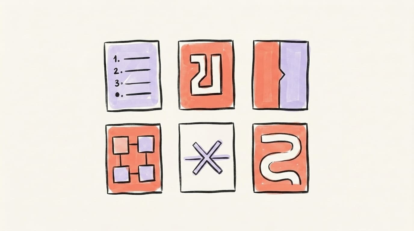
The fastest way to start is to stop inventing structure and reuse a proven one. These six formats cover the vast majority of high-performing carousels, and each maps cleanly to a goal — teaching, proving, or storytelling. To pick the right one, start from what you want the post to do, not from the idea itself: if your goal is to teach a process, reach for the Step-by-Step or the Framework; if it's to prove a result, the Before/After is built for that; if it's to earn comments and saves, the Myth-Buster invites debate; and if you want emotional reach and shares, the Story carries the furthest. When in doubt, the Listicle is the safest default — easiest to write and the most consistent performer. Pick one, fill in the slides, and ship it. The point of a template is repetition: when your slides look and flow the same way every time, your audience recognizes your content in the feed before they even read the name.
Here are six LinkedIn post ideas in carousel form you can copy today:
- The Listicle — "7 mistakes killing your reach." One point per slide. The easiest format to write and the most reliable performer.
- The Step-by-Step — "How I built X in 5 steps." A process broken into numbered slides. Great for how-to authority.
- The Before/After — show a transformation (a rewritten post, a redesigned profile, a metric that moved). Visual contrast does the work.
- The Framework — name a repeatable method (e.g., "the 3C caption formula") and give one slide per part. Naming things makes them shareable.
- The Myth-Buster — "5 LinkedIn 'rules' that are wrong." Contrarian takes earn saves and comments.
- The Story — a personal narrative ("I lost a client. Here's what it taught me.") told one beat per slide. The highest ceiling for emotional reach.
Every one of these ends the same way: a final slide with a clear call to action — follow, comment, or save. Don't let the last slide just trail off.
How Do You Write a Hook Slide That Stops the Scroll?
Your first slide is the entire ballgame — it's the only thing most people see in the feed, and it decides whether anyone swipes to slide two. A strong hook slide makes one specific, tension-filled promise in under about 60 characters so it stays readable as a thumbnail. The reliable formula is [who it's for] + [the gap or tension] + [the payoff]: "Posting daily and still invisible? The 1 fix that 3x'd my reach." That structure works because it shifts from informational ("10 LinkedIn tips") to provocative ("the LinkedIn tip everyone ignores"). Carouselli's hook breakdown groups the highest-performing openers into five types: the mistake hook ("7 mistakes killing your engagement"), the contrarian hook ("stop personal branding — do this instead"), the numbers hook ("5 principles from $1M brands"), the story hook, and the how-to hook. Whichever you pick, write the hook first and spend more time on it than on any other slide — distribution lives or dies on slide one.
Avoid vague openers like "Some thoughts on LinkedIn." Specificity and a hint of conflict beat cleverness every time. If you want a deeper teardown of openers that work, our guide to hook formulas for social media covers hook patterns that apply to both slides and captions.
How Can You Design a Carousel Without a Designer?
You don't need design skills or paid software to make carousels that look professional — you need a template and consistency. The free path is the same one most creators use: build a reusable layout in Canva (which has hundreds of ready-made LinkedIn carousel templates), keep your cover, body, and closing slides on the same grid and color scheme, then export the whole thing as a PDF. Google Slides and PowerPoint work just as well if you'd rather not learn a new tool — design your slides, then "save as PDF." The goal isn't a flashy design; it's a recognizable one. When every carousel you post shares the same visual signature, people start recognizing your content at a glance, which compounds over time. Keep backgrounds clean, use one accent color, make the text big enough to read on a phone, and let white space breathe. A plain, legible carousel beats a cluttered, over-designed one every time.
Here's a clear walkthrough of building a reusable carousel template — cover, body, and closing slides — from Breakcold:
How Do You Post and Caption a Carousel for Max Reach?
Posting a carousel is straightforward, but the caption is where most people fumble the reach they just earned. On desktop or mobile, tap Start a post, choose Add a document, upload your PDF, and give the document a real title (everyone sees the filename, so don't ship "Untitled-final-v3"). Then write a caption that does one job: make people curious enough to swipe — don't summarize the slides. Lead with a hook in the first ~150 characters so it lands before the "see more" cut on mobile, the same way you'd open a text post. Per Oktopost's 2026 best practices, keep the caption focused (roughly 100-200 words), and if you want clicks, drop the link in the caption — never inside the PDF, where it won't be tappable. For timing, B2B carousels tend to perform best Tuesday through Thursday mornings; if you're unsure when your specific audience is online, check your own analytics for the hours your posts actually land.
A repeatable rhythm matters more than any single optimal minute. Two carousels a week is a sustainable cadence for most creators — enough to build recognition without flooding your audience. One viral carousel rarely changes an account; a steady stream of good ones does.
How Do You Repurpose Carousels Across X and Threads?
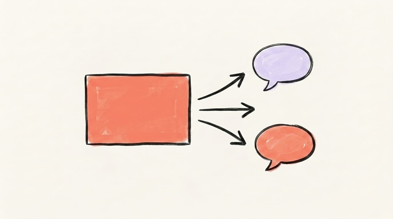
One carousel is really one idea broken into pieces — which makes it the perfect source material for X and Threads. The repurposing move is direct: each slide becomes a post. Your hook slide becomes the opening tweet or Threads post. Your body slides become the replies in a thread. Your closing slide becomes the CTA. You've already done the hard thinking by structuring the carousel; now you're just changing the wrapper. A 10-slide listicle carousel translates almost one-to-one into a 10-part X thread, and the same skeleton works as a Threads chain. This is how one piece of work becomes three platforms' worth of content without three times the effort. The mistake to avoid is copy-pasting the exact slide text — each platform has its own rhythm, so tighten the language for X's brevity and loosen it slightly for Threads' more conversational tone.
For a system to turn one core idea into platform-native posts, our guide to generating LinkedIn post ideas pairs well here: brainstorm once, build the carousel, then fan it out. The carousel is the anchor; everything else is a remix.
Turning One Carousel Into a Week of Content
The hardest part of carousels isn't the design — it's writing tight, well-structured copy that actually flows, then turning that same idea into posts for your other platforms. Postory's AI post writing handles the second half: give it your carousel idea (or a YouTube video, article, or rough notes) and it drafts platform-native versions for X, Threads, and Bluesky in your voice. You build the carousel; Postory turns it into the rest of the week.
Try Postory free — turn one carousel idea into X, Threads, and Bluesky posts in your own voice.
FAQ
Q: Are LinkedIn carousels the same as document posts?
Yes. LinkedIn doesn't have a dedicated "carousel" button like Instagram — you create one by uploading a PDF through the Add a document option, and LinkedIn turns each page into a swipeable slide. "Carousel" and "document post" refer to the same format.
Q: How many slides should a LinkedIn carousel have?
Aim for 8-12 slides. That range consistently performs best: fewer than 5 feels too thin to justify the format, and more than 15 risks losing readers before the final slide. LinkedIn technically allows far more, but longer isn't better here.
Q: What size should a LinkedIn carousel be in 2026?
Export your PDF at 1080x1350px (4:5 portrait) for maximum mobile screen space, or 1080x1080px (1:1 square) for a format that looks consistent on desktop and mobile. Keep the file under 3 MB and key content about 80px from every edge so nothing gets cropped.
Q: Do carousels really get more reach than text posts?
On average, yes. Socialinsider's 2026 benchmark of 1.3 million posts found native documents are the highest-engagement format at 7.00%, ahead of text at 4.50%. The reason is dwell time — swiping signals sustained attention, which the algorithm rewards with wider distribution.
Q: Can I put a link inside a LinkedIn carousel?
Not a clickable one. Links placed inside the PDF aren't tappable on LinkedIn. If you want people to click through, put the URL in the post caption instead, and tell readers to find it there.
Q: How often should I post carousels?
About two per week is a sustainable cadence for most creators — enough to build visual recognition without overwhelming your audience. Carousels are best used as the depth format alongside regular text posts, not as your only format.
Q: What's the best tool to make a LinkedIn carousel for free?
Canva is the most popular free option, with hundreds of ready-made LinkedIn carousel templates. Google Slides and PowerPoint work just as well — design your slides, then export as a PDF. The key is reusing one template so your content stays recognizable.
Related articles
Is LinkedIn Premium Worth It for Creators in 2026?
A candid tier-by-tier review of LinkedIn Premium in 2026 — who actually needs Career, Business, Sales Navigator, or Recruiter Lite, and who should stay free.
Jun 12, 2026

LinkedIn Analytics: The 6 Metrics That Actually Matter
Your LinkedIn dashboard shows dozens of numbers. Here are the six that actually predict growth — plus a 10-minute weekly review.
Jun 8, 2026
LinkedIn SSI Score: What It Is and How to Improve It
Your LinkedIn SSI score is a free 0-100 number that rates how you use the platform. Here's what it measures and how to move it.
Jun 7, 2026